The brand stops drifting
Colors, logo, type: rules, not memories. A new visual starts from the brand book, not a file lost in Drive.
We set the identity (you, or your company) and the system that holds it everywhere. Site, app, pitch, social: same face, same rules, same voice.


Logo, colors, type, usage rules. Enough to produce without reinventing every visual.
The reference document. The team opens it before designing a page, a pitch, or a campaign. That is what keeps the brand stable over time.
Tokens, components, rhythm. The site and the app stay aligned with the identity, even when several people touch the product.
Tone, photos, social, when we go into personal branding. The person and the brand speak the same language.
Without a shared document, every new site, every slide, every vendor rewrites the brand. With a brand book, the face stays the same. We put it in the work section so you can see how much this deliverable changes what comes next.
Colors, logo, type: rules, not memories. A new visual starts from the brand book, not a file lost in Drive.
The design system reuses the same tokens. The site, the app, and the next screen already speak the same language.
Fewer back-and-forths on the exact shade. Decisions are already made. We build, we do not renegotiate the charter every sprint.
The core offer sets the identity and the design system. As an extra option, a deeper personal branding: positioning, photo, social, voice. Yasmine El Khamlichi works with you. We decide at scoping: it is an extra line.
For personal branding, Yasmine works with you: scoping, art direction, brand book. Steven sets the design system on the product side. The two ends meet.
We show them like sites: brief, solution, deliverable. The first case is ours. The ABK brand book is both the method and the proof.
 Identity
An identity that holds everywhere.
The ABK brand book, written together with the design system. Colors, type, logo rules, tokens. The source of truth so the site, social, and the next pages speak the same language.
Open ABK Brand Book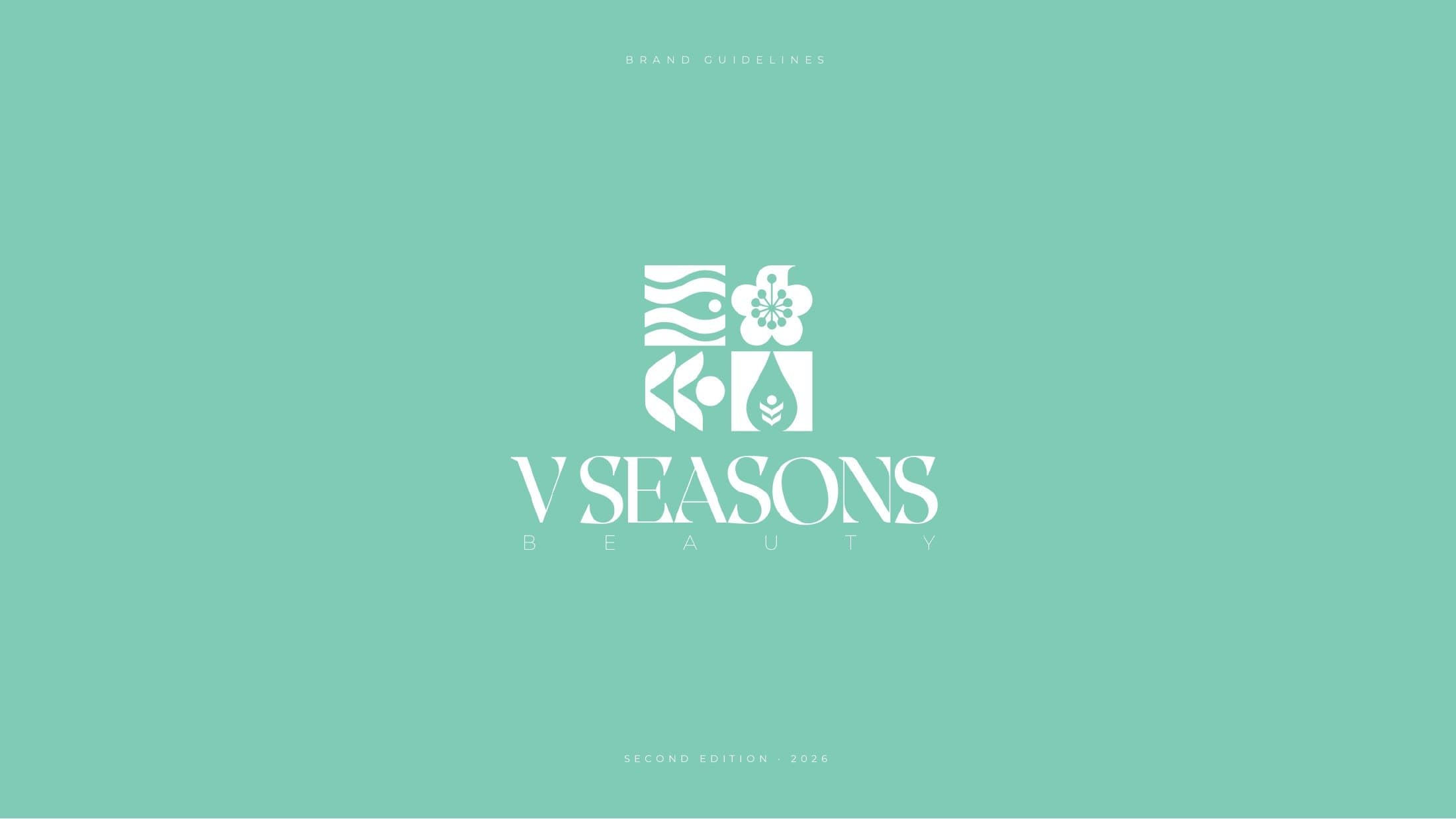 Identity
The four seasons, plus yours.
A beauty centre with a massage section. V Seasons: the V is the Roman five — four seasons, and a fifth, the client's. Full brand book: symbol, color, type, photography, applications.
Open V Seasons Beauty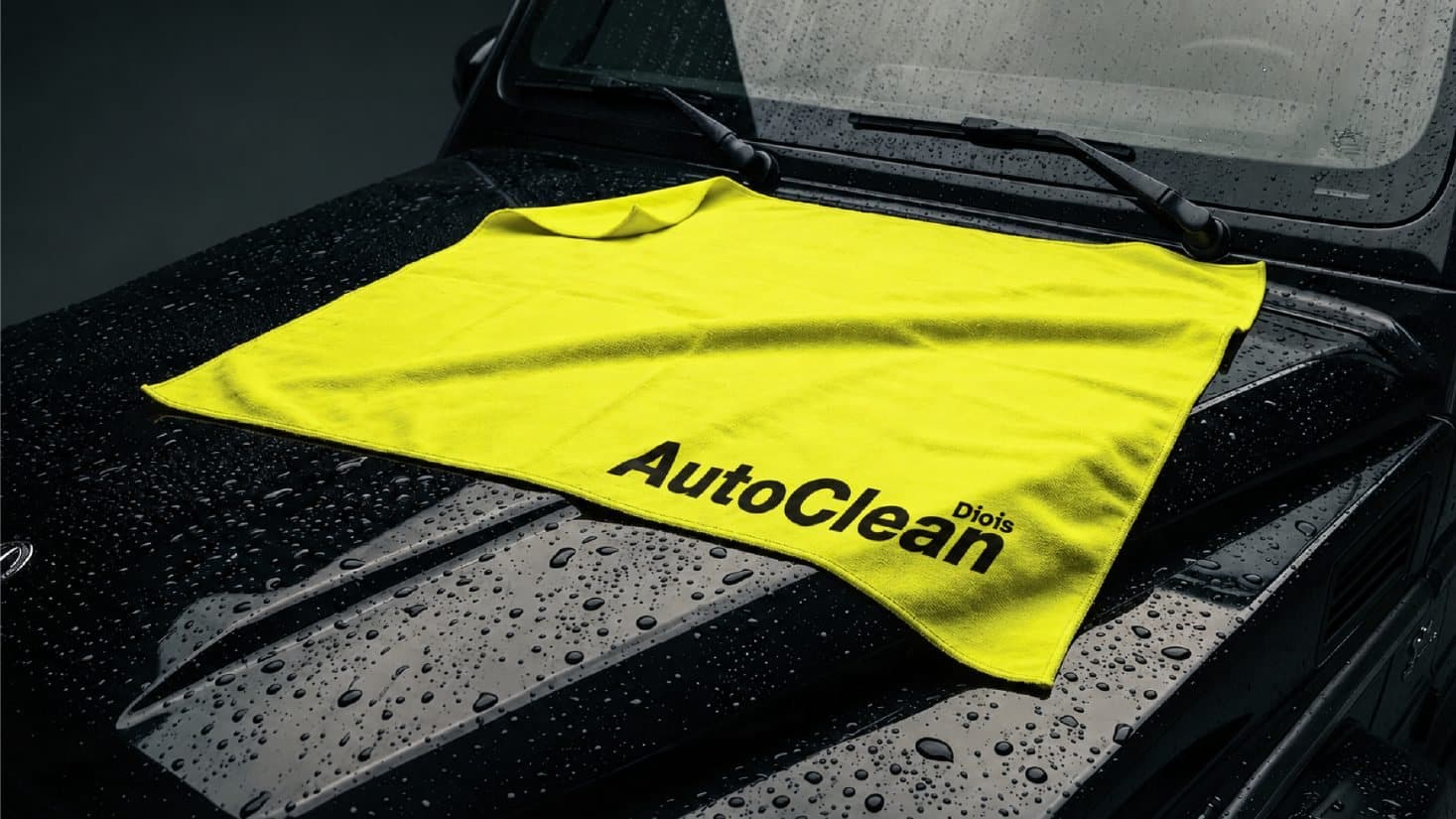 Identity
Yellow, black, and a car that shines.
Car cleaning in the Diois. Yellow identity, splash mark, Helvetica Neue. Brand book in 12 boards: color, type, avatars, van, signage, merch.
Open AutoClean DioisWe ship the identity and the interface system in the same scope. Logo, colors, voice on one side. Tokens, components, UI rules on the other. They hold together.
It is the document the team opens before producing. Without it, every page, every slide, every vendor rewrites the brand. With a brand book, the face stays stable, and so does the product.
Deeper support with Yasmine El Khamlichi: positioning, presence, photo, voice. It sits on top of the identity and the design system. We add it at scoping if you need it.
Yes, and that is often the right order: identity and system first, then the site or the product. We can also catch a charter that has already drifted.
It depends on the scope: logo and brand book, or identity plus design system, or complete personal branding. We give you a range at scoping, same as for a site.
We scope with Yasmine, we ship the brand book and the design system, and we put them to work for the product.
Book a scoping call